NetPayAdvance
Aug - dec 2023

Revamping the application process for loans.
Background
NetPayAdvance is a resource for online personal loans through the US, looking to remove the anxiety around online lending. Although an application process sounds simple, this project took many iterations, updating copy, and complex prototyping within Figma!
Problem
Using tools like Mouseflow, we were able to see that the current form was receiving a large drop-off of users at various steps. We wanted to solve this issue and increase conversion rate so we identified these issues that needed addressing:
Obvious design issues (spacing, alignment, buttons, etc.)
Inconsistent capitalization of labels and color accessibility
Wasted use of precious screen real-estate
North Star
To optimize the user flow when going through this new customer application.
Conversion
Positive growth in user conversions and reduced in-app journey drop-offs.
Conversion
Positive growth in user conversions and reduced in-app journey drop-offs.
Efficiency
The current UI is quite frankly old and legacy. Modernizing the UI helps with credibility as well.
Efficiency
The current UI is quite frankly old and legacy. Modernizing the UI helps with credibility as well.
Engagement
Users able to accomplish the application process faster and more efficiently than before.
Engagement
Users able to accomplish the application process faster and more efficiently than before.
Motivations
Before getting to redesigning, I wanted to understand why people took loans. Some common uses are debt consolidation, emergency expenses, growing and managing business, and more.
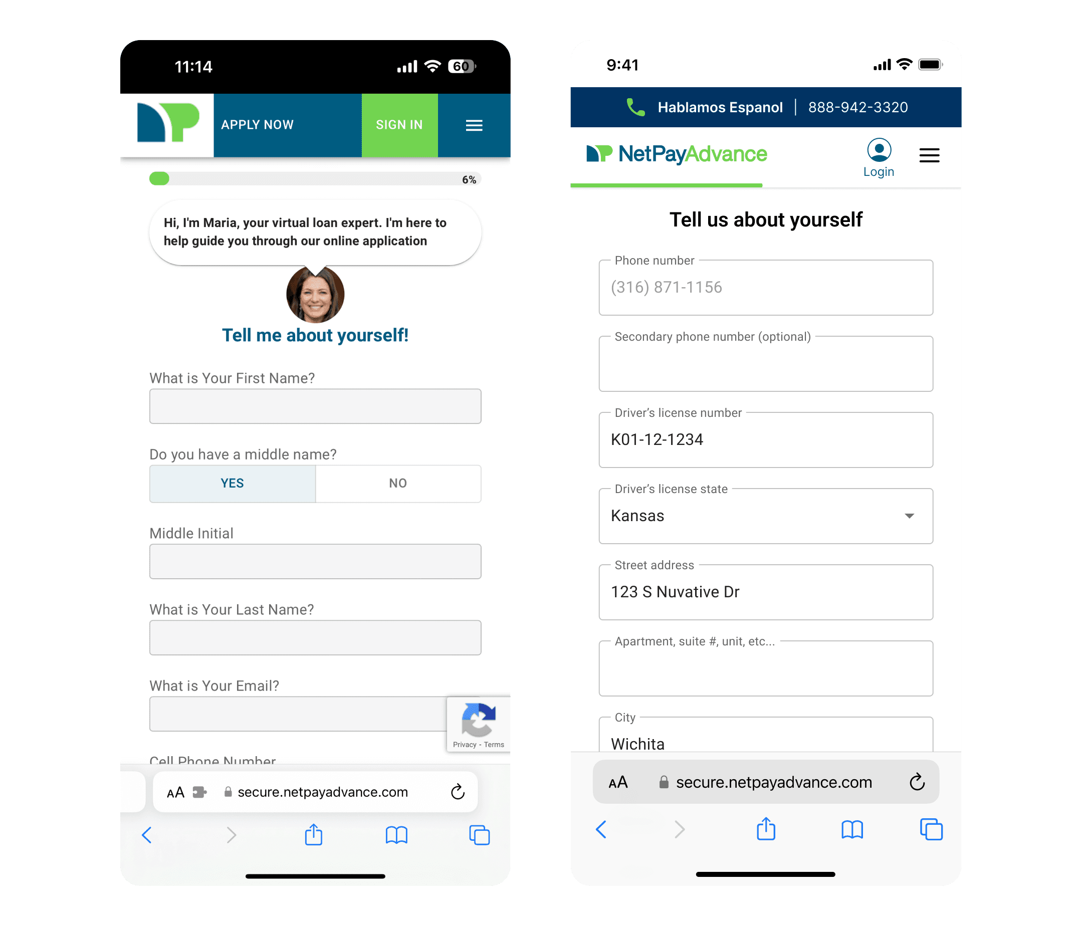
Legacy
Here is a before and after shot of a screen post-update. We removed the "Maria" assistant as she took up real estate and we noticed that users were not really paying too much attention to her. Sorry, Maria 😅
We used the Outlined variant of the Text Field from Material UI to provide a comfortable touch area for users to select, and the new design even condensed the form a bit.
Design Journey
In this design journey, I learned that there was not a linear design process to follow. Feedback was incredibly important throughout this process as well, with a lot of back and forth throughout the stages.
Ideation
In order to streamline the daunting application form, I had to figure out how to organize data into relevant sections in order to enhance user-friendliness and efficiency without compromising the necessary fields.
User Flow
We formed four different flows with the sections placed in different orders and discussed which one seemed the most optimal in terms of efficiency and easy onboarding.

Design & Implementation
When it came to design, we were constrained into making sure to only use Material UI components when it came to fields, buttons, icons, etc. This would assure an efficient hand-off process when it eventually gets to the hands of our developers.
Account Creation
The first part we created was the account creation process. We made sure to include the iOS keyboard, error states, password requirements, and a password check.
There was also a conversation surrounding progress bars and which one to implement between a circle progress bar or a line progress bar underneath the header. After discussion, we decided the line progress bar was the desired solution in terms of efficacy and appearance.

Multi-Factor Authentication
Statistics show that this area was the most difficult for users to go through. After reviewing footage (through Mouseflow recordings!), it seems the issues mainly revolve around our systems failing to send the user their code, or the user just dropping off when they see that they have to enter something personal like a phone number.
The backend systems failing to send the user their authentication code is a situation I do not have much control over, but I can help in users dropping off. I decided to add a trust-factor badge at the bottom of the screen, providing users some testimonials in order to give them more confidence about the loan process and NPA.

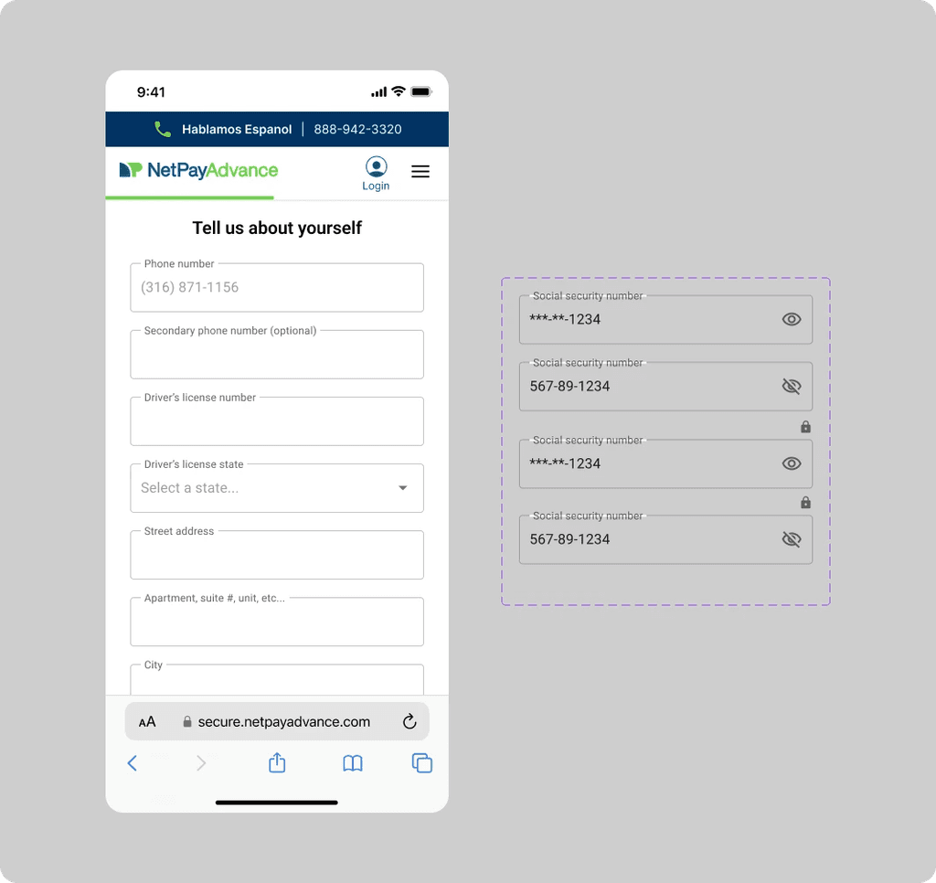
Tell Us About Yourself
One of the lengthier pages, we needed the essential information here for loan processing. In order to increase trust with the social security number submission, we provided a tool-tip that users could click on for a modal to pop-up and give the user more information.
Income Status
This area made more a complicated prototyping process! With three different sections and multiple buttons in each section affecting the outcome, many frames were created in order to satisfy all those situations. I’m sure there was a more efficient solution (Figma variables 😮) but I have not learned that yet 😅 (I will soon!).

Interactive dropdowns
The next section asks the user for information in regards to how they answered in the Income Status portion of the application. In order to provide a better prototyping experience, I learned how to use components to allow selection of each item within a dropdown. A very fun learning opportunity, honestly.

Form Completion
The rest of the application consisted of legal jargon, a denial page, a verification page, or a congratulations page. In order to showcase these results, I had to place various outcomes on one origin point.

Outcomes
Handoff
Using tools like Zeplin, I was able to organize the flows in a neat fashion and hand it off to the engineering team for development.
Handoff
Using tools like Zeplin, I was able to organize the flows in a neat fashion and hand it off to the engineering team for development.
Testing
User testing with the new design resulted in an increase in completion rate.
Testing
User testing with the new design resulted in an increase in completion rate.
Users
Using feedback forms and surveys, we were able to conclude that a large majority of users preferred the new design, yay!
Users
Using feedback forms and surveys, we were able to conclude that a large majority of users preferred the new design, yay!
Learnings & Challenges
Although a simple and not exactly riveting application to work on, I learned so so much from this. One of my biggest challenges was that people tend to focus on details that don’t really matter. For example, when we were trying to decide between four different flows, a stakeholder was caught up in the design of a specific component.
I had to learn how to communicate and keep the team’s vision on the overarching goal. In this specific example, the goal was to figure out a desired flow, not why something looks the way it does.
Another thing I learned from this experience is that when it comes to prototyping, sometimes less is more. I wanted to create a 1:1 application in Figma, allowing the user to basically feel like they are using the application.
This mostly just results in confusion or a buggy experience for people unfamiliar to Figma. I learned to tone it down and only show the essential steps, instead of making every single interaction.
NetPayAdvance
Aug - dec 2023
Revamping the application process for loans.
Background
NetPayAdvance is a resource for online personal loans through the US, looking to remove the anxiety around online lending. Although an application process sounds simple, this project took many iterations, updating copy, and complex prototyping within Figma!
Problem
Using tools like Mouseflow, we were able to see that the current form was receiving a large drop-off of users at various steps. We wanted to solve this issue and increase conversion rate so we identified these issues that needed addressing:
Obvious design issues (spacing, alignment, buttons, etc.)
Inconsistent capitalization of labels and color accessibility
Wasted use of precious screen real-estate
North Star
To optimize the user flow when going through this new customer application.
Conversion
Positive growth in user conversions and reduced in-app journey drop-offs.
Efficiency
The current UI is quite frankly old and legacy. Modernizing the UI helps with credibility as well.
Engagement
Users able to accomplish the application process faster and more efficiently than before.
Motivations
Before getting to redesigning, I wanted to understand why people took loans. Some common uses are debt consolidation, emergency expenses, growing and managing business, and more.
Legacy
Here is a before and after shot of a screen post-update. We removed the "Maria" assistant as she took up real estate and we noticed that users were not really paying too much attention to her. Sorry, Maria 😅
We used the Outlined variant of the Text Field from Material UI to provide a comfortable touch area for users to select, and the new design even condensed the form a bit.
Design Journey
In this design journey, I learned that there was not a linear design process to follow. Feedback was incredibly important throughout this process as well, with a lot of back and forth throughout the stages.
Ideation
In order to streamline the daunting application form, I had to figure out how to organize data into relevant sections in order to enhance user-friendliness and efficiency without compromising the necessary fields.
User Flow
We formed four different flows with the sections placed in different orders and discussed which one seemed the most optimal in terms of efficiency and easy onboarding.
Design & Implementation
When it came to design, we were constrained into making sure to only use Material UI components when it came to fields, buttons, icons, etc. This would assure an efficient hand-off process when it eventually gets to the hands of our developers.
Account Creation
The first part we created was the account creation process. We made sure to include the iOS keyboard, error states, password requirements, and a password check.
There was also a conversation surrounding progress bars and which one to implement between a circle progress bar or a line progress bar underneath the header. After discussion, we decided the line progress bar was the desired solution in terms of efficacy and appearance.
Multi-Factor Authentication
Statistics show that this area was the most difficult for users to go through. After reviewing footage (through Mouseflow recordings!), it seems the issues mainly revolve around our systems failing to send the user their code, or the user just dropping off when they see that they have to enter something personal like a phone number.
The backend systems failing to send the user their authentication code is a situation I do not have much control over, but I can help in users dropping off. I decided to add a trust-factor badge at the bottom of the screen, providing users some testimonials in order to give them more confidence about the loan process and NPA.
Tell Us About Yourself
One of the lengthier pages, we needed the essential information here for loan processing. In order to increase trust with the social security number submission, we provided a tool-tip that users could click on for a modal to pop-up and give the user more information.
Income Status
This area made more a complicated prototyping process! With three different sections and multiple buttons in each section affecting the outcome, many frames were created in order to satisfy all those situations. I’m sure there was a more efficient solution (Figma variables 😮) but I have not learned that yet 😅 (I will soon!).
Interactive dropdowns
The next section asks the user for information in regards to how they answered in the Income Status portion of the application. In order to provide a better prototyping experience, I learned how to use components to allow selection of each item within a dropdown. A very fun learning opportunity, honestly.
Form Completion
The rest of the application consisted of legal jargon, a denial page, a verification page, or a congratulations page. In order to showcase these results, I had to place various outcomes on one origin point.
Outcomes
Handoff
Using tools like Zeplin, I was able to organize the flows in a neat fashion and hand it off to the engineering team for development.
Testing
User testing with the new design resulted in an increase in completion rate.
Users
Using feedback forms and surveys, we were able to conclude that a large majority of users preferred the new design, yay!
Learnings & Challenges
Although a simple and not exactly riveting application to work on, I learned so so much from this. One of my biggest challenges was that people tend to focus on details that don’t really matter. For example, when we were trying to decide between four different flows, a stakeholder was caught up in the design of a specific component.
I had to learn how to communicate and keep the team’s vision on the overarching goal. In this specific example, the goal was to figure out a desired flow, not why something looks the way it does.
Another thing I learned from this experience is that when it comes to prototyping, sometimes less is more. I wanted to create a 1:1 application in Figma, allowing the user to basically feel like they are using the application.
This mostly just results in confusion or a buggy experience for people unfamiliar to Figma. I learned to tone it down and only show the essential steps, instead of making every single interaction.