Infange
July - Jun 2024
An intuitive workspace aimed to solve miscommunication.
Background
"I say A. You say A. I meant A. You really meant B."
Looking to solve everyone's common problem of miscommunication, I led the design of the Infange dashboard and agenda pages from beginning to end.
I led end-to-end designs, conducted user research, pitched to stakeholders, and collaborated with developers.


Problem
Meetings can be better.
We've all experienced the moment when we sat in a meeting, and right after we end the meeting, we've forgotten everything said (unless you have really good memory). You don't want to ask the other attendees because it's embarrassing and you don't want to be that person.
I was brought on as the sole product designer for this product, looking to build a tool that would help us solve the issue of miscommunication or unproductive meetings.
North Star
To become an intuitive meeting productivity tool that improves team alignment, efficiency, and engagement.
Alignment
60% of users report meetings being more aligned and productive after adopting Infange
Alignment
60% of users report meetings being more aligned and productive after adopting Infange
Efficiency
Users accomplish agenda items 25% faster on average compared to traditional meetings
Efficiency
Users accomplish agenda items 25% faster on average compared to traditional meetings
Engagement
50%+ satisfaction rating on ease of collaboration and communication features
Engagement
50%+ satisfaction rating on ease of collaboration and communication features
After being brought onto the team, I was given an understanding of the project and what our goals were. Infange was an already existing product. Although it was very bare-bones, it had the basic functionality set up, and my goal was to optimize the user's experience with it and make it pretty.

The company and stakeholders were very new to the idea of design thinking, so the responsibility laid on my shoulders to help improve the team and product. Infange went through a full UX refresh in order to modernize and improve upon the design.

Before the arduous task of building Infange, I needed to get a good understanding of the purpose of it. I began with a one-on-one meeting with the CEO, where he told me:
"The intent for Infange is to allow us to maintain good conversation." — CEO
A simple phrase, yet pretty impactful. This conversation allowed me to get an understanding of:
The project vision and scope
Our target users
Current pain points with the product
Following this meeting, we strategized a plan to build Infange from a clean slate, creating a solid foundation so we could future-proof the project. My participation on the project can be divided into two parts:
A calendar dashboard that allows you to manage your time efficiently
Live meeting agendas to maintain effective communication
After we decided this, I created some low and mid-fidelity wireframes to narrow down our vision for the product.
Prior to the revamp, I interviewed current users of the basic Infange workspace to understand their typical workflows. The interviews gave me actionable things to focus on to improve the way users interact with the existing platform. A question I asked was: "What do you currently dislike about Infange?"

Key Insights
Alignment
Time is an invaluable resource, and calendar apps that we are used to utilizing have limited functionality.
Alignment
Time is an invaluable resource, and calendar apps that we are used to utilizing have limited functionality.
Miscommunication
Something that is inevitable in the workplace is miscommunication. People forget and misunderstand. How can we mitigate this to always have good conversations?
Miscommunication
Something that is inevitable in the workplace is miscommunication. People forget and misunderstand. How can we mitigate this to always have good conversations?
Calendar
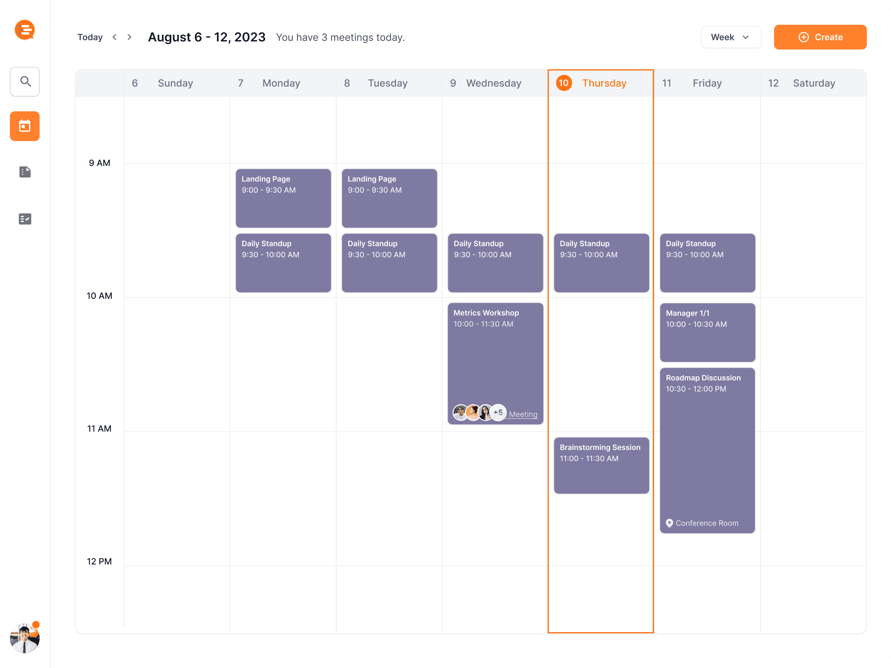
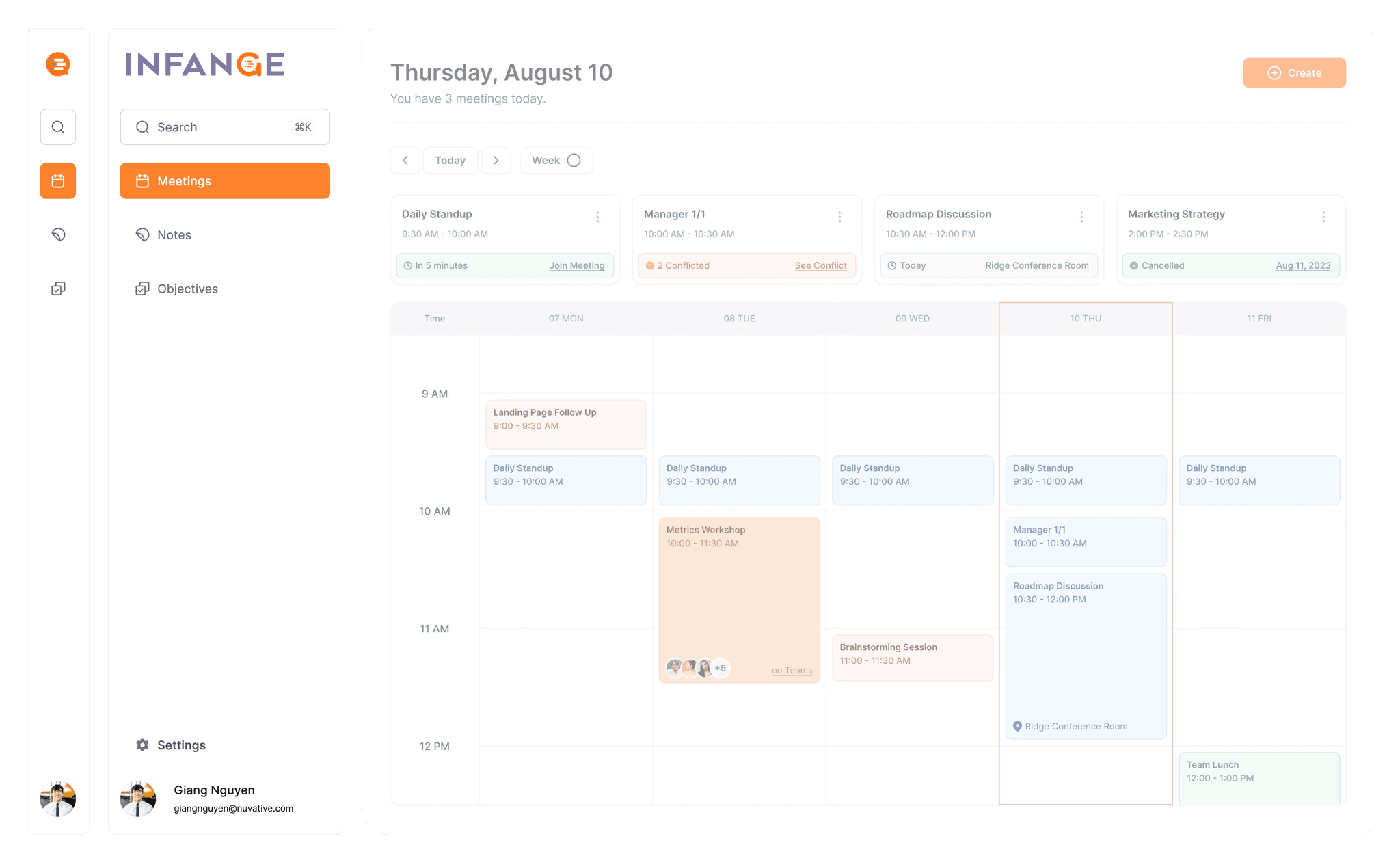
The calendar is the primary dashboard of Infange. The overall design prioritized a clean, minimal look. This assures that the user would not be confused and would be able to dive deep into Infange efficiently.

The most important stuff at a glance
The user is first introduced to their day with the header, which tells them today’s date along with an upcoming summary of what their day will look like. Header blocks are above the calendar, intended to give users quick access to their upcoming agenda items or if they need to be aware of any notifications.

Let's get to navigating
The sidebar is expandable to optimize page real-estate. When the user hovers over it, they can access the search functionality and navigation to other pages like notes and objectives.
What are we having?
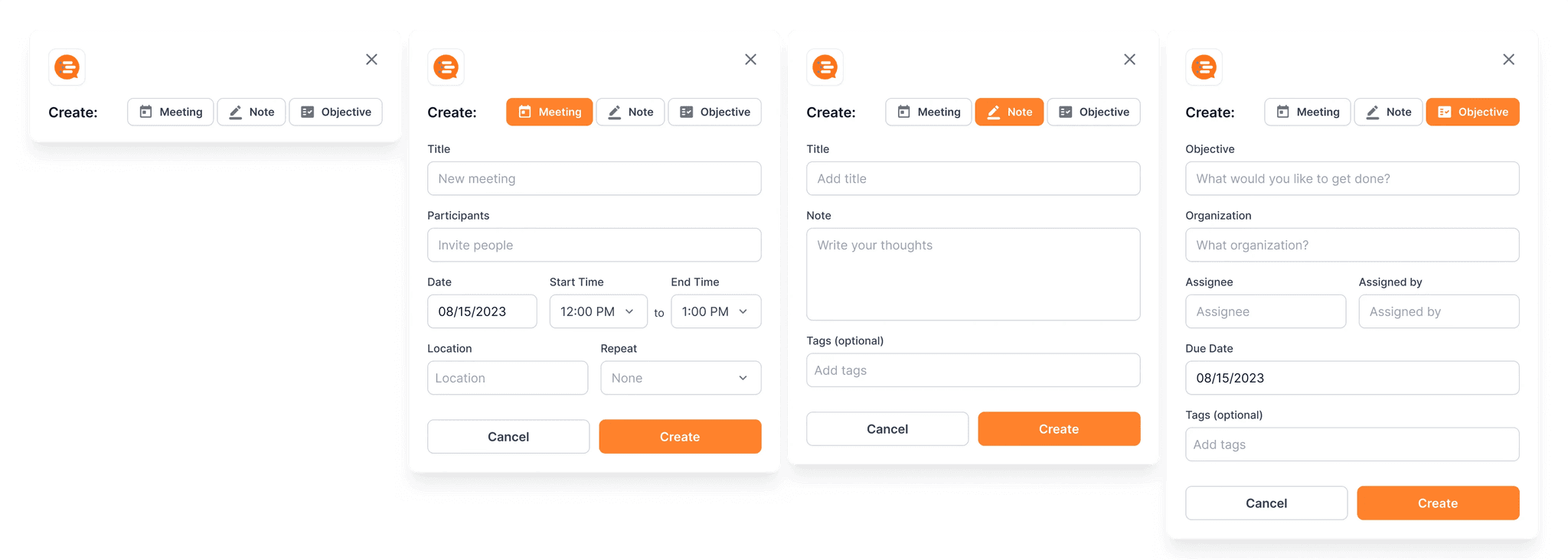
The create button on the top right pulls up a modal which gives the user three options: Meeting, Note, and Objective. They can select through these to create what they need.
Speed and efficiency!
Command+k interfaces are quickly growing in popularity, used to create a web experience where any action done by clicking can be done through a command menu. We wanted to implement this into Insync in order to provide users a fast and robust tool to maximize efficiency.
Live Meeting Agendas
Live meeting agendas are the meat and potatoes of Infange. Think Google Docs fusioning with Microsoft Teams. Once a meeting has begun, it starts for every attendee, and everybody can follow along, live. Agenda items are highlighted one at a time in chronological order, collapsing once users check it off in order to maintain page cleanliness.
Uhh.. what did we talk about yesterday?
A button to check previous meetings, where users can get a brief summary of past meetings, and have the ability to navigate there if they want a more in-depth recap. This is powered by the smart system comparing identical metadata (same agenda title, attendees, etc.) so users have a quick method to look back on previous notes.
Let's walk through the meeting
Once the meeting begins, it begins for everybody viewing the meeting. The top agenda item becomes highlighted to signify its active status. Agenda items have comments in order to provide a way to converse between users for more specific topics.
Users can complete items by hitting complete at the bottom. We decided to add the "Is this item complete" question so users have a sense of accomplishment when completing each item. This collapses the agenda item to clean up the page.
The complete button stays fixed at the bottom so users don't have to scroll up, even for long paragraphs.
Outcomes
Handoff
Finalized interactive prototype delivered to engineering team for development
Handoff
Finalized interactive prototype delivered to engineering team for development
Testing
Usability study results proving a 25% increase in task completion rate with the new designs
Testing
Usability study results proving a 25% increase in task completion rate with the new designs
Collaboration
Worked closely with PM and engineers to ensure technical feasibility
Collaboration
Worked closely with PM and engineers to ensure technical feasibility
Conclusion
The result is a clean, minimalist calendar and robust live meeting agendas that provide teams with clarity. Through prototypes, design systems, usability tests, and engineering alignment, Infange offered me an excellent opportunity to learn the ins and outs of building a new product.
One of my biggest challenges with Infange was presenting to and challenging stakeholders. Because the company was so new to the idea of user experience design, I had to back up my findings with research and data. The product has gone through multiple iterations, finally reaching a point where we were happy with the end result.
In the future, I hope to work on creating awesome interactions for the product, so users can experience the story of their meetings through those interactions.
Infange
July - Jun 2024
An intuitive workspace aimed to solve miscommunication.
Background
"I say A. You say A. I meant A. You really meant B."
Looking to solve everyone's common problem of miscommunication, I led the design of the Infange dashboard and agenda pages from beginning to end.
I led end-to-end designs, conducted user research, pitched to stakeholders, and collaborated with developers.
Problem
Meetings can be better.
We've all experienced the moment when we sat in a meeting, and right after we end the meeting, we've forgotten everything said (unless you have really good memory). You don't want to ask the other attendees because it's embarrassing and you don't want to be that person.
I was brought on as the sole product designer for this product, looking to build a tool that would help us solve the issue of miscommunication or unproductive meetings.
North Star
To become an intuitive meeting productivity tool that improves team alignment, efficiency, and engagement.
Alignment
60% of users report meetings being more aligned and productive after adopting Infange
Efficiency
Users accomplish agenda items 25% faster on average compared to traditional meetings
Engagement
50%+ satisfaction rating on ease of collaboration and communication features
After being brought onto the team, I was given an understanding of the project and what our goals were. Infange was an already existing product. Although it was very bare-bones, it had the basic functionality set up, and my goal was to optimize the user's experience with it and make it pretty.
The company and stakeholders were very new to the idea of design thinking, so the responsibility laid on my shoulders to help improve the team and product. Infange went through a full UX refresh in order to modernize and improve upon the design.
Before the arduous task of building Infange, I needed to get a good understanding of the purpose of it. I began with a one-on-one meeting with the CEO, where he told me:
"The intent for Infange is to allow us to maintain good conversation." — CEO
A simple phrase, yet pretty impactful. This conversation allowed me to get an understanding of:
The project vision and scope
Our target users
Current pain points with the product
Following this meeting, we strategized a plan to build Infange from a clean slate, creating a solid foundation so we could future-proof the project. My participation on the project can be divided into two parts:
A calendar dashboard that allows you to manage your time efficiently
Live meeting agendas to maintain effective communication
After we decided this, I created some low and mid-fidelity wireframes to narrow down our vision for the product.
Prior to the revamp, I interviewed current users of the basic Infange workspace to understand their typical workflows. The interviews gave me actionable things to focus on to improve the way users interact with the existing platform. A question I asked was: "What do you currently dislike about Infange?"
Key Insights
Alignment
Time is an invaluable resource, and calendar apps that we are used to utilizing have limited functionality.
Miscommunication
Something that is inevitable in the workplace is miscommunication. People forget and misunderstand. How can we mitigate this to always have good conversations?
Calendar
The calendar is the primary dashboard of Infange. The overall design prioritized a clean, minimal look. This assures that the user would not be confused and would be able to dive deep into Infange efficiently.
The most important stuff at a glance
The user is first introduced to their day with the header, which tells them today’s date along with an upcoming summary of what their day will look like. Header blocks are above the calendar, intended to give users quick access to their upcoming agenda items or if they need to be aware of any notifications.
Let's get to navigating
The sidebar is expandable to optimize page real-estate. When the user hovers over it, they can access the search functionality and navigation to other pages like notes and objectives.
What are we having?
The create button on the top right pulls up a modal which gives the user three options: Meeting, Note, and Objective. They can select through these to create what they need.
Speed and efficiency!
Command+k interfaces are quickly growing in popularity, used to create a web experience where any action done by clicking can be done through a command menu. We wanted to implement this into Insync in order to provide users a fast and robust tool to maximize efficiency.
Live Meeting Agendas
Live meeting agendas are the meat and potatoes of Infange. Think Google Docs fusioning with Microsoft Teams. Once a meeting has begun, it starts for every attendee, and everybody can follow along, live. Agenda items are highlighted one at a time in chronological order, collapsing once users check it off in order to maintain page cleanliness.
Uhh.. what did we talk about yesterday?
A button to check previous meetings, where users can get a brief summary of past meetings, and have the ability to navigate there if they want a more in-depth recap. This is powered by the smart system comparing identical metadata (same agenda title, attendees, etc.) so users have a quick method to look back on previous notes.
Let's walk through the meeting
Once the meeting begins, it begins for everybody viewing the meeting. The top agenda item becomes highlighted to signify its active status. Agenda items have comments in order to provide a way to converse between users for more specific topics.
Users can complete items by hitting complete at the bottom. We decided to add the "Is this item complete" question so users have a sense of accomplishment when completing each item. This collapses the agenda item to clean up the page.
The complete button stays fixed at the bottom so users don't have to scroll up, even for long paragraphs.
Outcomes
Handoff
Finalized interactive prototype delivered to engineering team for development
Testing
Usability study results proving a 25% increase in task completion rate with the new designs
Collaboration
Worked closely with PM and engineers to ensure technical feasibility
Conclusion
The result is a clean, minimalist calendar and robust live meeting agendas that provide teams with clarity. Through prototypes, design systems, usability tests, and engineering alignment, Infange offered me an excellent opportunity to learn the ins and outs of building a new product.
One of my biggest challenges with Infange was presenting to and challenging stakeholders. Because the company was so new to the idea of user experience design, I had to back up my findings with research and data. The product has gone through multiple iterations, finally reaching a point where we were happy with the end result.
In the future, I hope to work on creating awesome interactions for the product, so users can experience the story of their meetings through those interactions.